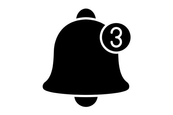
Mastering Visual Cues: The Notification Glyph Icon
In the fast-paced world of digital interaction, clarity is currency. Whether you are designing a complex mobile application, a user-centric website, or a dynamic presentation, the way you communicate status to your user matters just as much as the content itself. This is where the Notification Glyph Icon steps in. It is not merely a decorative bell or a simple "dot"; it is a carefully engineered visual asset designed to bridge the gap between the user and the system. As a designer or business owner, you understand that every pixel counts. A poorly rendered icon can make a premium application look cheap, while a crisp, scalable glyph reinforces trust and professionalism.
The visual personality of the Notification Glyph Icon is defined by its neutrality and adaptability. It doesn't scream for attention with unnecessary flair; instead, it offers a clean, geometric silhouette that respects the hierarchy of your layout. The style leans towards modern minimalism, ensuring it pairs well with both sans serif and serif typefaces without creating visual dissonance. It possesses a subtle roundness that softens its presence, making it feel approachable rather than intrusive—a crucial trait when you are interrupting a user's workflow to deliver an update.
Unpacking the Asset: What’s Inside the Zip?
When you acquire a design asset, the value lies in its utility across different mediums. The Notification Glyph Icon package is structured to remove technical barriers, allowing you to focus on creative execution rather than file conversion. The package includes five distinct formats, ensuring you have the right tool for every job:
- AI (Adobe Illustrator): The master file. This is where you can dive deep into the vector paths, adjusting anchor points, stroke weights, or colors to perfectly match a specific brand palette. If you are building a complex logo design or a detailed illustration system, this is your starting point.
- EPS: A versatile format that plays nicely with a wide range of vector software beyond Adobe’s ecosystem. It ensures that the icon remains editable even if you are using CorelDraw or older design software.
- JPG: The standard for web use where transparency isn't required. While the Notification Glyph Icon looks best with a transparent background, the JPG format is optimized for quick loading times in blog posts or email newsletters where the background color is static.
- PNG (Transparent Background): Essential for layering. If you are placing the icon over a photograph, a gradient, or a textured background, the PNG format ensures clean edges without the "white box" effect. It is ready for immediate use in social media graphics or web design mockups.
- SVG: The gold standard for modern web development. SVGs (Scalable Vector Graphics) are code-based, meaning they load instantly and scale infinitely without pixelation. For mobile apps and responsive websites, this format is critical for maintaining visual fidelity on high-DPI screens.
Because these assets are 100% vector-based, you never have to worry about resolution. You can scale the Notification Glyph Icon from the size of a favicon to the side of a billboard, and it will retain its sharp, mathematical precision. This scalability is a cornerstone of modern typography and iconography.
Strategic Applications: Where This Icon Shines
The true test of a design asset is its versatility. The Notification Glyph Icon is not restricted to one niche; it functions as a universal visual language. For mobile app developers, it is the heartbeat of the user interface. It signals new messages, pending tasks, or system alerts. Its "ready to use" nature means you don't have to spend hours tweaking bezier curves to fit into your navigation bar; it is designed for maximum usability right out of the box.
In the realm of web design, the icon serves as a critical navigational aid. It helps establish a visual hierarchy, guiding the user's eye to actionable items. When used alongside a clean sans serif font in a header, it creates a cohesive look that screams competence. For marketers and publishers, the icon can be repurposed in editorial design—perhaps as a bullet point for "Key Takeaways" or a highlight marker in an infographic. Its simplicity allows it to blend into dense layouts without cluttering the visual field.
Even in print and packaging design, this icon has a place. Imagine a "smart" product box that features a QR code; the Notification Glyph Icon can visually indicate where to scan or where to look for updates. For presentation templates, it adds a layer of polish. Instead of using clipart that looks dated, using a crisp, vector glyph signals to your audience that you value quality and attention to detail.
Designing for Impact: Readability and Brand Perception
Icons are the shorthand of design. When a user sees the Notification Glyph Icon, they instantly understand a specific meaning without reading a single word. This cognitive shortcut is vital for engagement. However, the effectiveness of this communication relies on the icon's integration with your broader design system. If the icon is too thick compared to your body text, or too thin compared to your headers, it creates a subtle friction that disrupts the reading flow.
The "easy to edit" feature of this icon set allows you to manage that weight. By adjusting the stroke or the fill, you can ensure the icon matches the x-height and visual weight of your chosen typeface—whether that is a sturdy serif font for a law firm's brochure or a playful handwritten font for a lifestyle blog. This alignment is what separates amateur designs from professional brand identity work.
Furthermore, consistency breeds trust. If you use a specific style of notification icon on your website, your app, and your email signatures, you are reinforcing your brand identity. The Notification Glyph Icon provides a consistent visual anchor. It tells your audience that you are organized, responsive, and detail-oriented.
Practical Guidance for Implementation
Before dropping this icon into your next project, take a moment to evaluate the fit. Here are a few practical steps to ensure you get the most out of this asset:
- Check the Context: Does the "bell" or "alert" metaphor fit your specific use case? While it is standard for notifications, ensure it doesn't conflict with other UI elements, such as a "sound" or "settings" icon.
- Test the Pairing: Place the icon next to your primary typeface. Does it look like it belongs to the same family? If the icon is too rounded and your font is sharp and angular, consider using the AI file to tweak the corners slightly.
- Evaluate the Background: If you are using the PNG version, test it on both light and dark modes. Ensure the contrast ratio is high enough for accessibility standards. If you need to invert the colors, the vector files (AI/EPS/SVG) make this a one-click process.
- Licensing for Commercial Use: Always verify the licensing terms. For small business owners and entrepreneurs, ensuring you have the rights to use the asset in commercial templates or client work is non-negotiable. This icon set is designed for broad application, but due diligence is part of the professional workflow.
The Notification Glyph Icon is more than just a picture of a bell; it is a functional component of your user experience strategy. By leveraging its vector nature, cross-platform compatibility, and clean aesthetic, you can elevate your projects from simple layouts to professional, user-friendly environments. Whether you are crafting a brand identity, building an app, or designing a presentation, this icon offers the clarity and versatility that modern design demands. It is a small detail that makes a significant difference.
